
Although blue flowers don’t abound like pinks, reds or yellows, floral professionals nonetheless identified a range of fresh product that capture the essence of Pantone’s Color of the Year, Veri Peri.
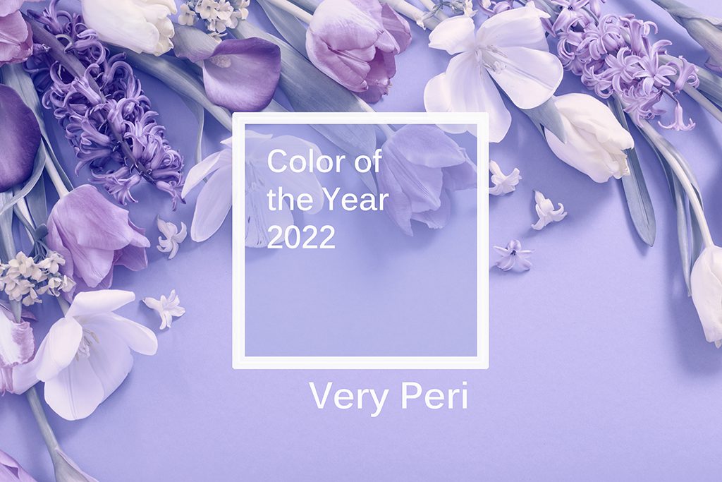
All is calm; all is bright. That’s the future we all crave and the mood the Pantone Color Institute struck with Veri Peri (Pantone 17-3938), a sophisticated shade of periwinkle that is the 2022 Color of the Year.
“Encompassing the qualities of the blues, yet at the same time with its violet red undertone, Very Peri displays a spritely, joyous attitude and dynamic presence that encourages creativity and imaginative expressions,” says Leatrice Eiseman, executive director of the Pantone Color Institute.
The selection reflects months of research into color influences, which includes fashion, art, technology, the entertainment industry, and popular travel destinations, as well as cultural stimuli, such as new lifestyles, political events and socio-economic conditions.
Although blue flowers don’t abound like pinks, reds or yellows, floral professionals nonetheless identified a range of fresh product that capture Veri Peri’s essence, including clematis, delphinium, grape hyacinth, irises, lilacs, ageratum, hydrangea, lavender and orchids.
“Blue/lavender carnations are perfect for this shade,” says Wendy Rockcastle, of Rockcastle Florist in Rochester, New York. “These are the spice to so many of my designs.”
Tucson, Arizona freelance designer Joyce Mason-Monheim, AAF, AIFD, AzMF, PFCI, called Veri Peri “the perfect balance” of cool and warm tones. “It comes off very neutral and would pair well with almost any color groupings,” she says, adding that there’s a great opportunity to tie in dried periwinkle materials for events and weddings.
Derek Woodruff, AIFD, CF, PFCI, also praised Veri Peri’s versatility. “It’s an amazing accent color to so many palettes,” says the owner of Floral Underground in Traverse City, Michigan. “If you pair it with reds and burgundies, it becomes regal. If you pair it with peaches, corals and pinks, it becomes vibrant and energized. If you pair it with greens, it becomes cool, calm, relaxed and fresh. It also looks beautiful with other shades of blues and purples.”
Andreia Boscata Muller, AIFD, FSMD, owner of The Flower Studio in Altamonte Springs, Florida, has already seen this shade requested for fall 2022 and winter 2023 weddings. “It will be great with mustard colors and burgundies,” she says.
In Charleston, South Carolina, customers go gaga for periwinkle. “It always sells out, especially in the spring with the fragrant hyacinths and stock,” says Lisa Holmes, owner of Tiger Lily Florist. “Our mokara and phalaenopsis orchids also come in shades close to Veri Peri, and they look stunning in multiples.”
Pantone’s pick aligns auspiciously for some floral companies. Teleflora, for instance, features periwinkle prominently in its 2022 catalogue, notably in several mosaic glass containers. Pioneer Imports and Wholesale in Berea, Ohio, will have permanent botanicals in a similar shade in its Comfort Zone Collection, to be released this spring.

Pioneer Imports and Wholesale in Berea, Ohio, will release this spring a permanent botanical collection in a shade similar to the Pantone Color of the Year. Photo courtesy of 1826 Photographic.
Sarah Botchick of Pioneer Imports and Wholesale says the company choose the periwinkle shade based on trend reports and the use of calm colors — rather than neutrals — in home décor.
“For a while now we saw one of two ends of the spectrum in interior décor — either extremely neutral beiges and grays, or extremely strong and dark colors,” she says. “But for 2022 we saw the calmer colors taking a center stage.”
Concerned you won’t get your hands on any periwinkle products given ongoing supply chain challenges? Don’t sweat it, says J Schwanke, AAF, AIFD, PFCI, founder of uBloom.com and host of “J Schwanke’s Life in Bloom” on PBS.
“In my opinion, not many consumers care about the color of the year unless it’s one they particularly love, one they’ve used to decorate their home or, on the outside chance, one they’re planning to use for their wedding,” he says, adding that floral design should be more about using what makes someone happy rather than following trends. “We have the distinct pleasure and honor to turn people’s feelings into flowers using an entire rainbow of colors.”
Katie Vincent is a contributing editor for the Society of American Florists.