
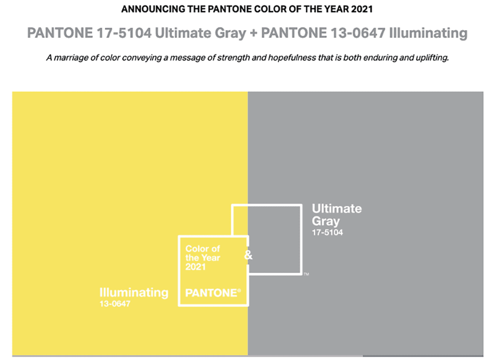
The Pantone Color Institute selected two hues for its 2021 Colors of the Year: a neutral, Ultimate Gray (Pantone 17-5104) and a lemony yellow, Illuminating (Pantone 13-0647) — an oft-used palette in floral design, which many industry professionals feel captures the tempered optimism for 2021.
As 2020 draws to a close (hallelujah!), the Pantone Color Institute has continued its annual tradition of forecasting the color that best connotes the year ahead. Given the complexity of world issues at the moment, the venerable design firm selected two hues, a neutral, Ultimate Gray (Pantone 17-5104) and a lemony yellow, Illuminating (Pantone 13-0647) — an oft-used palette in floral design, which many industry professionals feel captures the tempered optimism for 2021, particularly with the rollout of COVID-19 vaccines.
Separately, the colors could be interpreted as dreary (Ultimate Gray) or overly cheerful (Illuminating); together, they tell a story “that encapsulates deeper feelings of thoughtfulness with the promise of something sunny and friendly,” Pantone’s Dec. 9 announcement explained.
“The union of an enduring Ultimate Gray with the vibrant yellow Illuminating expresses a message of positivity supported by fortitude,” said Pantone’s executive director, Leatrice Eiseman, who has shared her expertise in the past at Society of American Florists events and in Floral Management magazine. “Practical and rock solid but at the same time warming and optimistic, this is a color combination that gives us resilience and hope.”
The selection reflects months of research into color influences, which typically includes fashion, art, technology, the entertainment industry and popular travel destinations, as well as cultural stimuli, such as new lifestyles, political events and socio-economic conditions. This year, of course, “you can’t get away from the overwhelming influence of the pandemic,” Eiseman said.
“Seeing the sunshine on a cloudy day — seems pretty perfect for 2021!” said Erin Esensee, business unit director for H-E-B Blooms in San Antonio, Texas. “I guessed it would be yellow, so I was half right.”
A big fan of the color combo, Robbin Yelverton, AAF, AIFD, MCF, PFCI, used both shades in his home (a gray bathroom and a yellow kitchen and breakfast nook). “The colors are also very user-friendly for the floral industry,” said the co-owner of Blumz…by JR Designs in the Detroit metro area. “I picture yellow roses, lilies and orchids with dusty miller and eucalyptus. I think these colors may end up in some summer weddings.”
Down in Altamonte Springs, Florida, Andie Muller, AIFD, FSMD, has recently designed several weddings in this particular palette. “It is a lovely combination,” said the lead designer for The Flower Studio. “I can name so many products that come in these colors, but my favorites are callas, oncidium orchids, crespidia, dahlia, pincushion proteas, silver brunnia, eucalyptus and dusty miller.”
Penny Curtis-Brauns, of Bonnetts Wholesale in Milan, Illinois, referenced many of the above suggested flowers and foliages, as well as freesia. “I love the complete contrasts, with gray being so neutral and yellow providing a warm pop of color,” she said. “And they work so well with patterns too.”
The abundance of yellow flowers — it’s available in nearly every category — is a huge blessing, said J Schwanke, AAF, AIFD, PFCI. “It’s an expensive color to mass produce because it requires saffron, the most expensive spice by ounce on the planet,” explained the CEO of uBloom.com, host of “J Schwanke’s Life in Bloom” on American public television and 2019 Floral Management Marketer of the Year winner. The announcement had him immediately dreaming of mustard-colored David Austin garden roses, chrysanthemums, pincushion and banksia proteas, tulips, LA hybrid and Oriental lilies and freesia. “There’s so much to choose from,” he said, adding that he thought Pantone nailed the selection and color names. “This is what’s truly happening right now,” he said. “It’s very empowering and rages positivity.”
Others had more a lukewarm reaction.
“I thought was very interesting, but the color duo doesn’t spark much joy for me,” said Jessica Davidson Munn, CFD, EMC, FDI, creative director of Fleurie in Portland, Oregon. “I’m longing for the days of Emerald and other punchy, sensuous jewel tones.”
“Umm, I think Pantone missed it this time,” said Lee Gallison, AIFD, owner of Gallison Design in Pasadena, California. “Don’t get me wrong, I love gray. But I’m not sure what they want to communicate here. The neutral and the possible? But most people, when they see neutral, will stay there and not move toward what’s possible.”
Paula Wilson-Hale, a freelance designer in the Philadelphia area, said she personally likes the combination, but didn’t feel it possessed the trend-setting quality typical of past Pantone picks. “Isn’t it kinda old?” she said. “I’ve seen it in floral and home decor for the past several years. It just doesn’t feel fresh anymore.”
Katie Vincent is the senior contributing writer and editor for the Society of American Florists.
